Kaplan Logo
The Kaplan logo is soft, playful and inviting.
White Space
Clear space is the area surrounding our logo that is kept free of other graphics and typography. It plays an essential role in ensuring our logo is easy to recognize across all of our communications. The minimum clear space surrounding the logo (both horizontal and vertical versions) is the height of the “K” in the “Kaplan” wordmark. All digital files for the logo have this clear space built in.
Minimum Size
The minimum size for our logo is .25" tall for print use, 20 pixels for digital applications, and .4" for embroidery. Although these are the minimum sizes, in most cases the logo will be shown larger. It should never be smaller than the minimum sizes, as it would compromise quality and legibility.
Downloads
The files below are the only approved versions and colors of the logo. Please select the format based on the application:
- CMYK and PMS: used for print pieces
- RGB: used for on-screen displays, PowerPoint presentations, videos, and websites
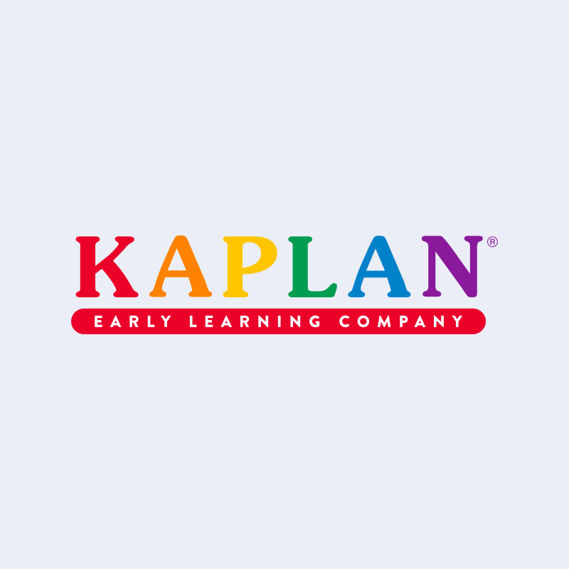
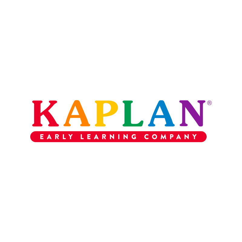
Full Logo
Full Color Logo on Sky Blue
| Web & Digital RGB |
|---|
Full Color Logo on White
| Web & Digital RGB |
|---|
Royal Blue Logo on Sky Blue
| Web & Digital RGB |
|---|
Royal Blue Logo on White
| Web & Digital RGB |
|---|
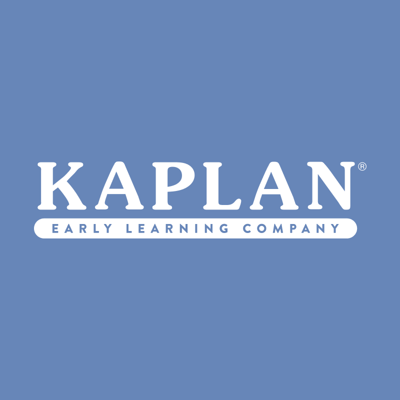
White Logo on Blue
| Web & Digital RGB |
|---|
White Logo on Green
| Web & Digital RGB |
|---|
White Logo on Lavender
| Web & Digital RGB |
|---|
White Logo on Purple
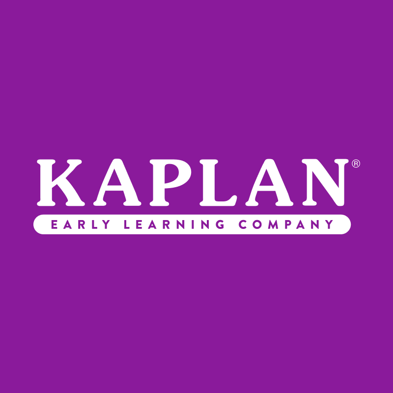
| Web & Digital RGB |
|---|
White Logo on Royal
| Web & Digital RGB |
|---|
Icon
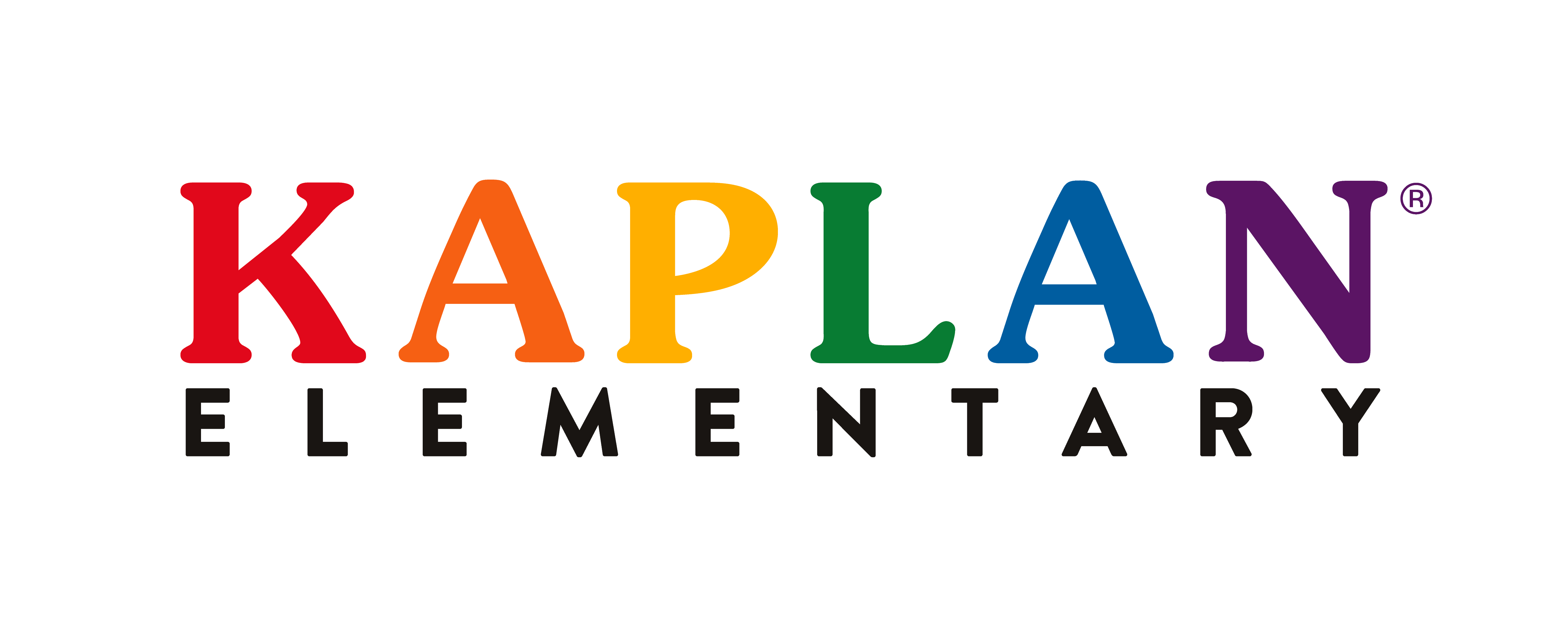
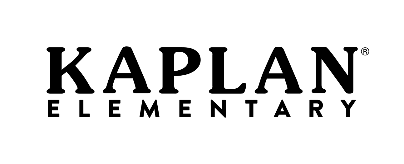
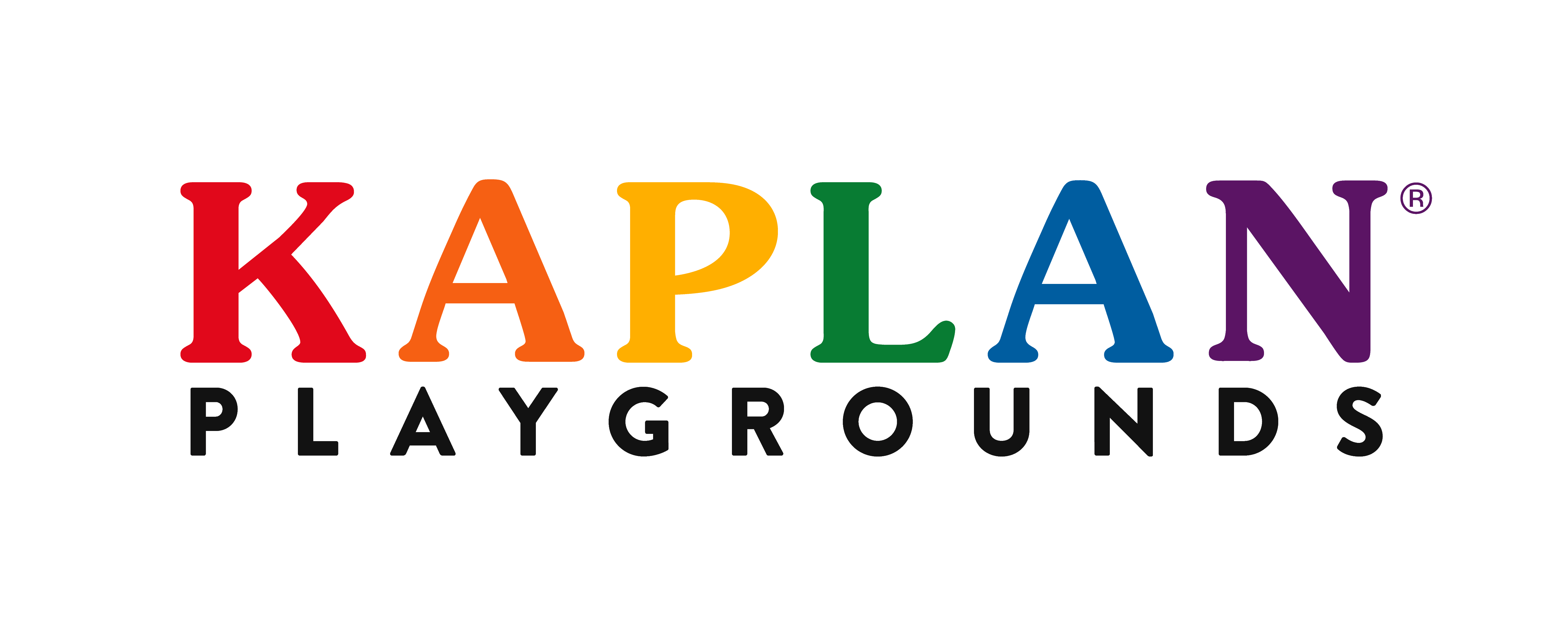
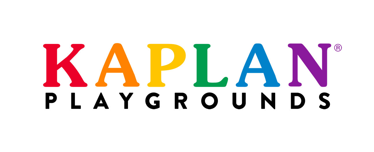
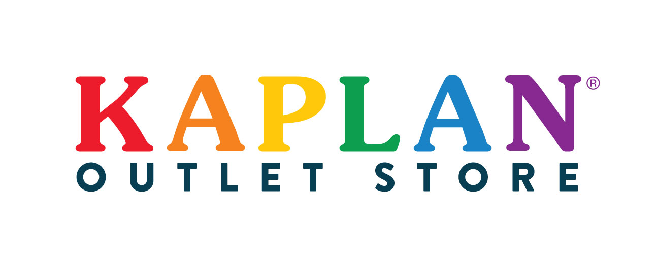
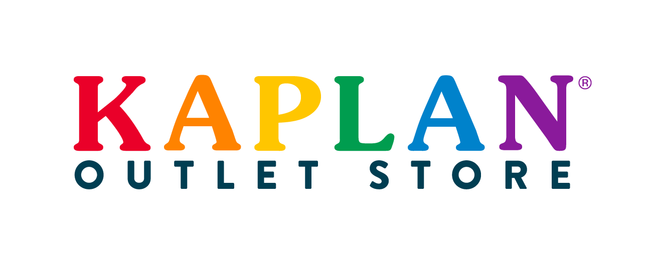
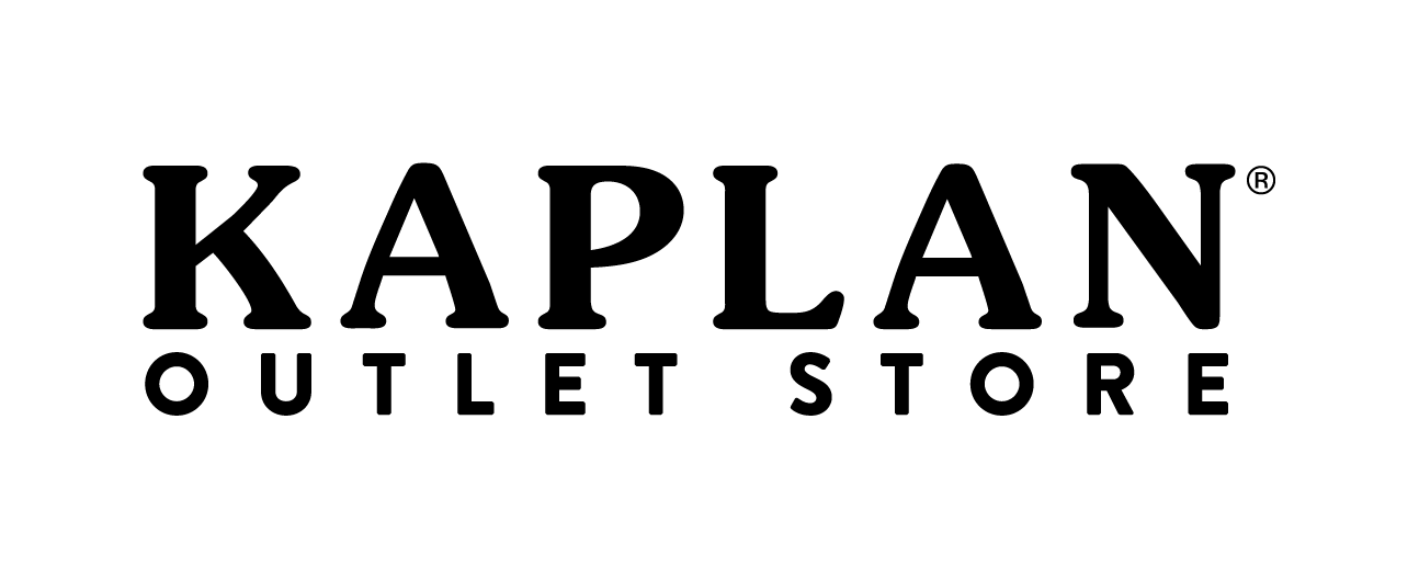
Sub-Brand Logos
The Kaplan brand consists of three sub-brands: Kaplan Elementary, Kaplan Playgrounds, and the Kaplan Outlet Store. Each of these sub-brands has its own logo that is an extension of the main Kaplan logo, just as each brand is an extension of the Kaplan family.
White Space
Each logo should be used with ample clear space surrounding it. Like the main Kaplan logo, the minimum clear space surrounding the logo (both horizontal and vertical versions) is the height of the “K” in the “Kaplan” wordmark. All digital files for the logo have this clear space built in.
Minimum Size
The minimum size for each logo is .25" tall for print use, 20 pixels for digital applications, and .4" for embroidery. Although these are the minimum sizes, in most cases the logos will be shown larger. They should never be smaller than the minimum sizes, as it would compromise quality and legibility.
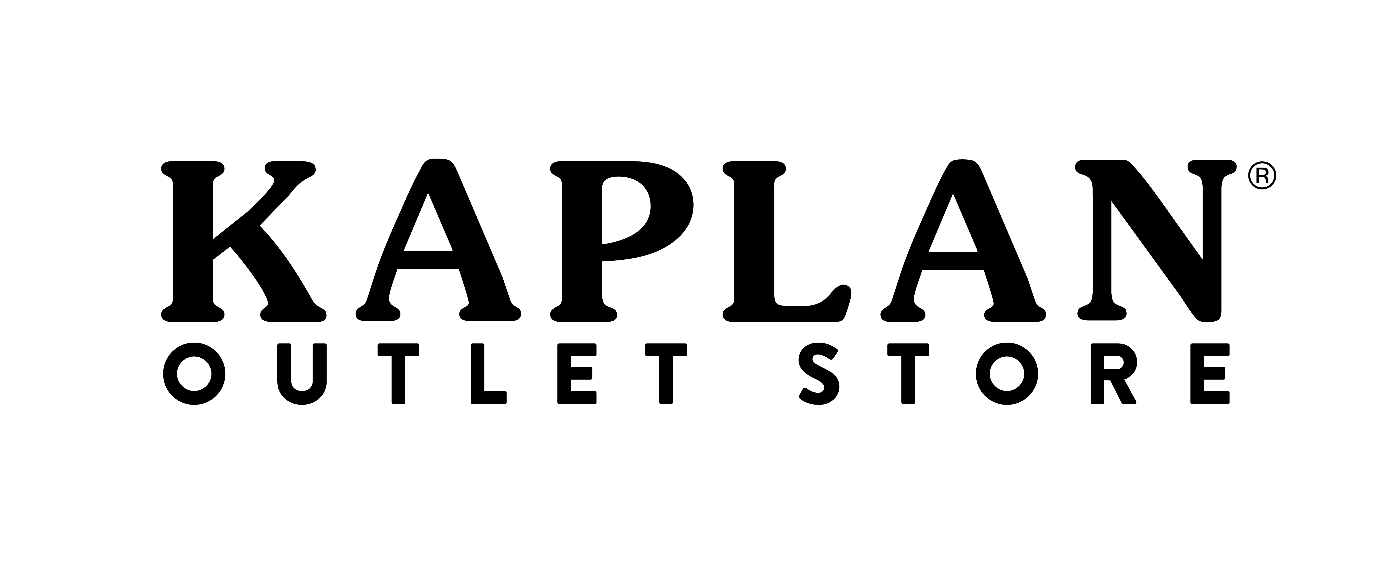
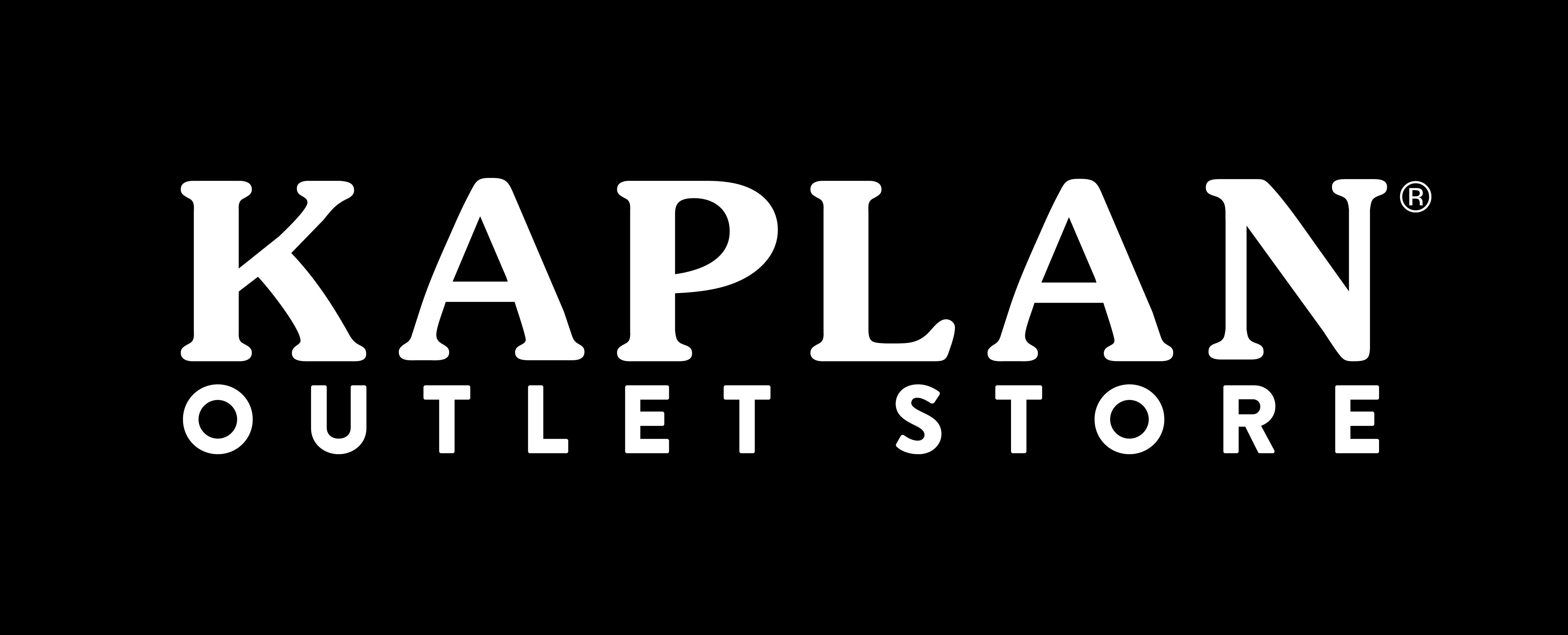
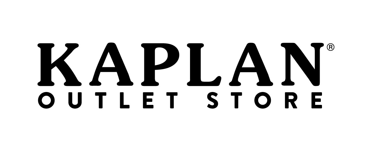
Downloads
The files below are the only approved versions and colors of the logo. Please select the format based on the application:
- CMYK and PMS: used for print pieces
- RGB: used for on-screen displays, PowerPoint presentations, videos, and websites
Proper Usage
Our logo is the key element of our visual identity. It shouldn't be modified, distorted, or altered in any way. Here are some examples of logo misuse to avoid:
- Do not alter color
- Do not alter size relationship between wordmark and Early Learning Company tagline
- Do not rearrange logo elements
- Do not skew
- Do not rotate
- Do not add drop shadow
- Do not outline
- Do not place logo on background that will make the logo illegible
- Do not create logo lockups
- Do not add holding shapes
- Do not crop the logo
- Do not use the Early Learning Company tagline on its own